 I love hearing the news that one of our clients had a great result using the work we did for them. The most recent big win I’m happy to report is Manatt, Phelps & Phillips, LLP, won a major lender liability/wrongful foreclosure action, obtaining a complete defense verdict in favor of its clients. Cogent Legal was hired to assist the Manatt trial team by creating graphics that helped bring order and understanding to this complex case.
The case involved Rincon Towers in San Francisco, which coincidentally is where I used to work; that’s where The Arns Law Firm set up shop when Bob Arns and I opened the firm in 1997. In 2007 Rincon Towers was purchased by the plaintiff in the case, who ultimately lost the property in foreclosure and sued multiple parties, seeking the property back and $40 million in damages. The case was a complex one involving many layers of parties, accountings on the properties and events over time. (For details on the case and the defense victory, read Manatt’s press release here).
Any complex transactional case such as this, which involves a great deal of accounting, lends itself to Excel spreadsheets that, by themselves, are not very helpful and make one’s eyes glaze over. We needed to help the trial team show a chronology of events and economic data based on the facts of the case and the experts’ opinions, so that the team could make their case to the judge as understandable and persuasive as possible. This was a bench trial, not a jury trial, which lends itself to more sophisticated or complex graphics, which are handed off to the judge and clerks so they can refer to them later as they’re writing the opinion.
Below are a few “sanitized” samples in which we changed the names of the witnesses and case information for the purpose of this blog post, but the samples illustrate the nature of the work Cogent Legal did on the case.
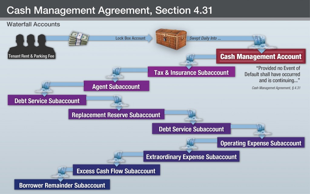
The first chart outlines the cash flow in the case. Its purpose was to make clear the order of funding to show no harm could have occurred as claimed by plaintiff. It’s an example of how a basic flow chart can be more understandable and visually appealing with the use of icons and colors. Also, generally speaking, the process of creating a graphic such as this can be an extremely helpful exercise for the trial team to undertake insofar as it aids them in organizing the case and resolving inconsistencies.

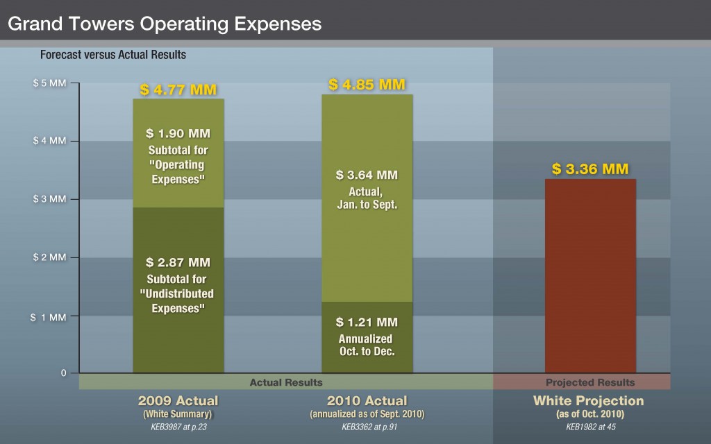
The following graphic is a pretty basic bar chart, but it manages to include a good amount of data and to illustrate the relations between the actual data and the projection. I’m including this sample to show how a set of data can be more visually appealing when it’s designed to go with the style of the other visual aids.

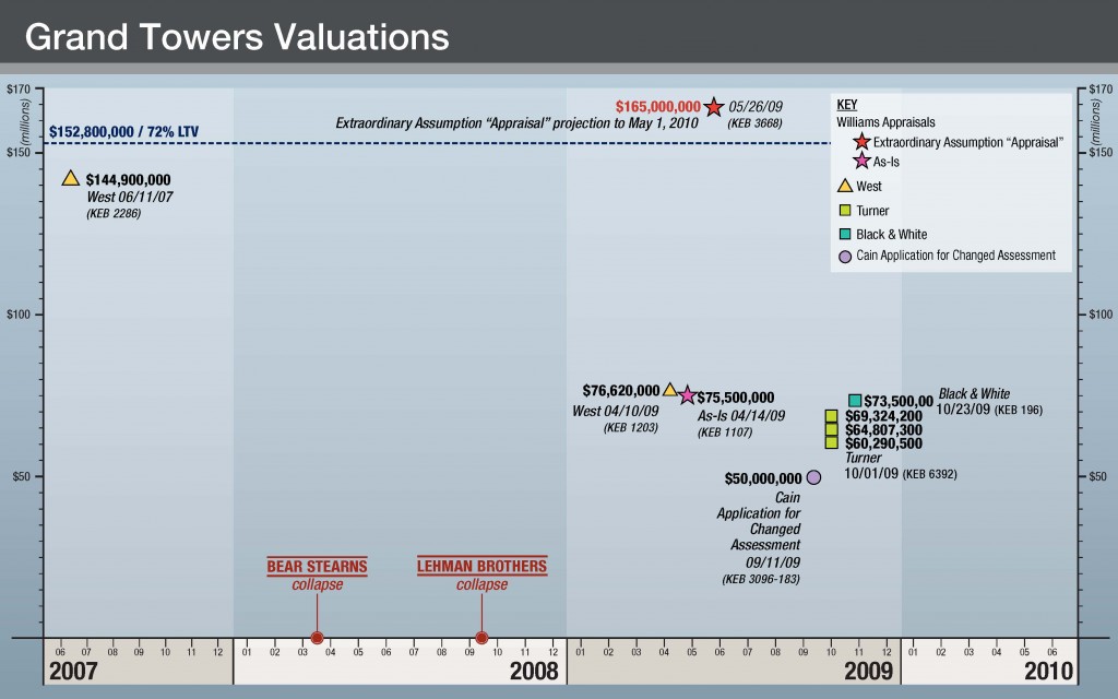
The final sample below is an example of a very effective scatter chart on a timeline. It shows an objective valuation of the property in 2007 before the market crash, and then a cluster of third-party valuations of the property after the crash. Up top, at the red star, it shows the plaintiff’s valuation of the property—which is literally “off the chart” and even higher than the pre-crash valuation.

We at Cogent are very happy for the success of the Manatt team. If you are involved with business litigation and would like to discuss how graphics might help your case, please don’t hesitate to contact me.
If you’d like to receive updates from this blog, please click to subscribe by email.

