
 Last week, Ken Broda-Bahm wrote a great piece about the recent State of the Union Address (“Check Your Alignment in Multiparty Litigation“), commenting on how the dueling responses by the Republican Party (Mark Rubio) and the Tea Party (Rand Paul) exposed the similar difficulties co-defendants in a trial face while trying to keep message control in front of a jury. Ken’s examination of the State of the Union Address through the lens of trial issues also reminded me of the post last year by Ken Lopez on the use of graphics in the State of the Union Address (“Presentation Graphics: Why the President is Better than You“), which related a number of great tips and showed why attorneys should look at the White House use of graphics in presentation, since they are certainly well done.
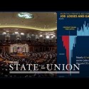
Better late than never, I figure it’s time for me to put in my two cents on the topic and show some examples from the State of the Union Address that might help attorneys improve their own use of charts and graphs in litigation. Visualizing and presenting data in an engaging, persuasive way is critically important for numbers-heavy cases involving financial transactions and economic data. I’ve seen attorneys present graphs and spreadsheets that are about as interesting as watching paint dry. The president’s team, by contrast, created graphs that hold the viewers’ attention and strengthen the points he makes orally.
The day after I watched the address live on TV, I looked at the online “enhanced” version at whitehouse.gov. I am obviously biased, but in particular I admire the president’s address because I really do love seeing graphics used effectively and well. It’s like being a football fan and watching a great football game when everything is done just right. One thing I like in particular is a point that Ken Lopez made very well: that every slide is “simple enough to understand in a moment or two.” All of the graphics are simple, yet carry a strong message. They are not intended to be objective, but rather to be like a closing statement when graphics are used to sway the viewer to your point of view.
Let’s look at a couple of ways these graphics use effective techniques to push their point of view fairly but persuasively. (more…)