Menu

Morgan Smith
Law Firm Marketing and Design Lessons Learned While Redoing My Website
 Earlier this year, I embarked on a months-long process of building a new, more sophisticated and customized website, which I’m happy to unveil at cogentlegal.com. This post will share some of what I learned about website design and law marketing through the process.
First, let me clear up confusion if you think you’re already looking at my website. You’re not—this is my blog, built separately on a WordPress platform—and I deliberately keep the two separate. I subscribe to the view that a firm’s website and blog are two related yet distinct vehicles with separate roles to play. Whereas a website is a marketing tool that functions as an online multimedia brochure, with the goal of spotlighting the firm’s services and interesting the visitor to contact and hire you, a blog is a more personal and casual voice for commentary and advocacy. Blogs also get updated much more frequently than websites and, I hope, attract repeat visitors who subscribe for updates. (This article by Sam Glover, “Get Your Law Blog Off Your Law Firm Website,” goes into more depth on this issue.)
Before hiring a firm to handle this project, I spent a great deal of time reviewing the websites of other law firms and litigation graphics firms to see what works well, what’s innovative, and what’s cliched and clunky. Law firm websites tend to be quite traditional and conservative. Even though I’m an attorney and our clients are other attorneys and law firms, I didn’t want Cogent Legal’s site to look like a law firm site. I wanted it to look more like an architecture firm’s site, with clean, modern lines and a visually engaging, easy-to-navigate portfolio of images.
Searching for a web design and branding firm that could understand and implement this vision, I went outside the circle of design and marketing firms that have built sites for many law firms to find a design firm whose portfolio conveyed the look and feel I wanted to emulate: Project6 in Berkeley.
Project6 assigned a project manager, designer and developer to our team, and they guided us through a process that dovetailed with my firm’s strategic planning insofar as it forced me to really think about and better understand the client base and their needs, as well as refine the firm’s goals. Taking into account the audience and goals for the site, Project6 developed several “mood boards” with different color palates, typefaces and other features. Some were serious and authoritative, others earthy and personable. We chose a style that conveyed industrial, modern and innovative, and we ultimately changed Cogent Legal’s logo to fit the new color scheme.
One of my goals was to create a home page on the new site that instantly conveyed Cogent Legal’s purpose, unique characteristics, aesthetic and quality—all with a “wow” factor. That way, visitors to the site could gain a pretty good understanding of what Cogent Legal is all about even if they never clicked through to the deeper pages.
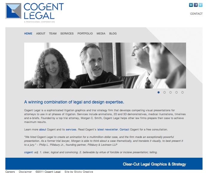
Here’s the old site’s home page for comparison:
On the old site, that big horizontal photo area, known as the “hero shot” (even though I’m not wearing a cape), rotated through several different slides that showed some of Cogent’s work samples but didn’t indicate what they represented. A user had to drill pretty deep into the portfolio subcategories to get a better sense of our service offerings.
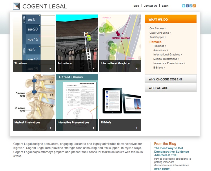
Here’s a screen shot of the new home page—but this static image really doesn’t do it justice. I hope you’ll visit the site to interact with it yourself, and please let me know in the comments below what you think.
The new site’s home page employs a “hero shot” carousel as well, but it has a text overlay that creates an F-shaped reading pattern so the eye moves vertically as well as horizontally. Some of the hero shots pop out as an animation to play (thanks to a Flowplayer plugin), and each hero image clicks through to a section of the portfolio with additional examples in that category. The three main menu bars change color when scrolled over. A “news crawl” beneath the main image subtly but effectively showcases recent firm news, blog posts and articles. Two text blocks under the hero carousel communicate the firm’s unique selling proposition.
One of my favorite areas of the new site is the “What We Do” landing page that highlights the firm’s portfolio and services. You can’t tell from the screen shot below, but when the cursor moves over any one of those six rectangles, a popup menu appears with different portfolio samples listed in that category so that the user sees the depth and breadth of work samples to explore. The righthand drop-down menu also shows the outline of what the firm does. All of this highlights the importance of smartly planning the site’s architecture to reflect an effective and sensible hierarchy of information.
A big part of the beauty of this site is the backend, invisible to visitors but a real asset to me. The site has a secure client login that will enable us to share works in progress confidentially with clients, and it’s built on Drupal, a content management system that I find easy to use.
In sum, here are a few pointers for any attorneys embarking on a website overhaul:
- Research the websites of your colleagues and competitors
- Integrate the website design process into your strategic planning so that the website reflects and helps achieve your firm’s goals
- Clearly define your audience and design your site with the user in mind; then, design the look and feel
- Maintain a lot of white space, using color sparingly yet effectively
- Carefully plan the site’s architecture and information hierarchy in a way that makes sense from a user’s perspective and imparts your key messages without having to drill down too deep in the site
- Build a site that works well on the back end so you can update it and troubleshoot on your own with minimal tech help
- Include social media and contact links so your visitor can connect with you
- Don’t build the site with a hard deadline in mind; plan for extra time to create it, and have a soft launch to iron out wrinkles
Call for comments: What website design and development tips do you have for attorneys?
If you’d like to receive updates from this blog, please click to subscribe by email.
Recent Posts
- Proper Digital Discovery, Part IV: Using Drones in Modern Litigation
- Proper Digital Discovery, Part III: Using Digital Imagery in Modern Litigation
- Proper Digital Discovery, Part II: Electronic Measuring Data
- How to Obtain Proper Digital Discovery, Part I: Photography
- California Courts – Latest Updates


