I love working as a trial technician because I get to be in the room where it happens, watching and listening to attorneys present their cases. As an attorney myself, I’ve been in their shoes, and I learn a lot by listening in court and thinking about the choices made in presentation.
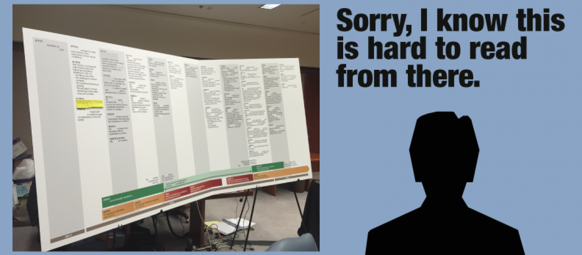
One thing I often note are apologies by the attorneys. Among those apologies, among the most frequent is some variant of “I know you can’t read this from there.”
This apology for unreadable text always makes me wince because it is a self-inflicted wound. When you show text to the jury, it should be because you want the jury to read and understand something. Large blocks of small, difficult-to-read text usually serve only to distract and annoy an audience.
Attorneys will often make this mistake with timelines because the attorneys have so much information they want to present on the timeline. Attorneys want a timeline summarizing their whole chronology, but often don’t think about how to get a jury to read and understand the timeline.
For example, below is a timeline used by the defense in an employment discrimination case (I’ve redacted references that identify the parties). The board was hinged, approximately 10 feet long, and required two easels to support it. When the board was presented, the attorney apologized “I know you can’t read this from there,” explaining that the courtroom was so big that the jury was too far from the board. Because the jury could not read the board, the attorney would occasionally gesture to the board, but most of the board remained unreferenced in the argument.
Avoiding Apologies for Unreadable Text
The content of the timeline was important to the presentation, and its presentation could potentially have been improved in various ways:
- Editing entries on the timeline could have improved readability: One key problem is that the timeline had so many entries, and was so verbose. Cutting the amount of text would have allowed larger and more readable fonts to be used.
- Simultaneous electronic presentation of the timeline could have helped: Another tactic to help the jury understand the timeline would have been to present details of the timeline on the screens in the court. These zoomed-in sections could be presented on PowerPoint or Trial Director as the attorney discussed the corresponding events of the timeline.
- Splitting the timeline up: An approach our clients often use is to present more than one timeline. This reduces the number of events on a timeline and lets the entries be larger and more readable.
- Don’t apologize: Another thing to think about is whether an apology helps, or might just be omitted. When I cook dinner and I’m missing an ingredient that I do without, I don’t announce the missing ingredient as I serve the dish. Rather, I let my companions enjoy the dish without calling attention to its possible defects. Similarly, in court, think about whether apologizing for unreadable text really helps you.
For more on using timelines, check out these posts:
Timeline Design For Litigation: When To Use A Static Timeline
How Interactive Timelines Build And Strengthen Opening Statements
You can see other examples of static and interactive timelines in our portfolio. Please share your thoughts, experiences and comments about timeline design with us in the comments.
If you’d like to receive updates from this blog, please click to subscribe by email.


