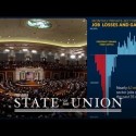
 Last week, Ken Broda-Bahm wrote a great piece about the recent State of the Union Address (“Check Your Alignment in Multiparty Litigation“), commenting on how the dueling responses by the Republican Party (Mark Rubio) and the Tea Party (Rand Paul) exposed the similar difficulties co-defendants in a trial face while trying to keep message control in front of a jury. Ken’s examination of the State of the Union Address through the lens of trial issues also reminded me of the post last year by Ken Lopez on the use of graphics in the State of the Union Address (“Presentation Graphics: Why the President is Better than You“), which related a number of great tips and showed why attorneys should look at the White House use of graphics in presentation, since they are certainly well done.
Better late than never, I figure it’s time for me to put in my two cents on the topic and show some examples from the State of the Union Address that might help attorneys improve their own use of charts and graphs in litigation. Visualizing and presenting data in an engaging, persuasive way is critically important for numbers-heavy cases involving financial transactions and economic data. I’ve seen attorneys present graphs and spreadsheets that are about as interesting as watching paint dry. The president’s team, by contrast, created graphs that hold the viewers’ attention and strengthen the points he makes orally.
The day after I watched the address live on TV, I looked at the online “enhanced” version at whitehouse.gov. I am obviously biased, but in particular I admire the president’s address because I really do love seeing graphics used effectively and well. It’s like being a football fan and watching a great football game when everything is done just right. One thing I like in particular is a point that Ken Lopez made very well: that every slide is “simple enough to understand in a moment or two.” All of the graphics are simple, yet carry a strong message. They are not intended to be objective, but rather to be like a closing statement when graphics are used to sway the viewer to your point of view.
Let’s look at a couple of ways these graphics use effective techniques to push their point of view fairly but persuasively.
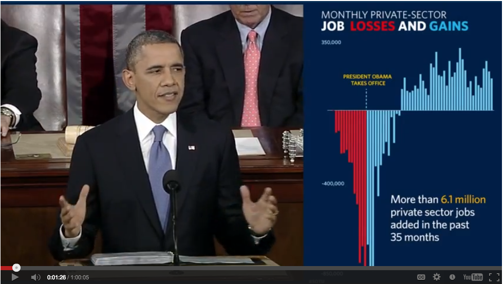
One of my favorite examples shows the job loss that started to end when Obama took office, and the recovery we are in now. It’s even more interesting to look at the differences between the 2013 version and the 2012 version. Here is the 2013 version of the graphic:
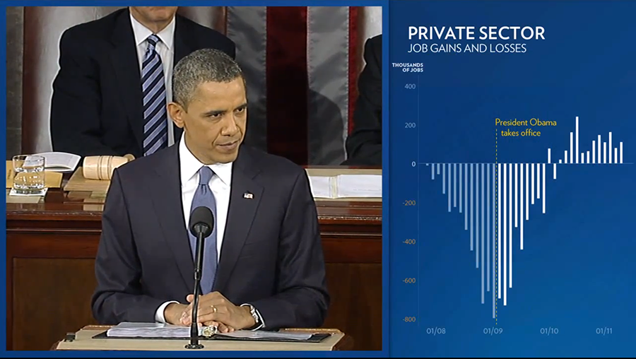
And here is the 2012 version of this graphic:
There are at least two key differences that greatly increase the effectiveness of this graphic in 2013 (besides additional data showing continuing job gains). First of all, the use of the red color in the job loss section (red, of course, being associated with Republicans) makes the overall graphic much more powerful, and the inclusion of the colored font for “Losses” and “Gains” allows for clear understanding of the color use without a key. I also like the use of red, white and blue, which gives a patriotic feel to the entire chart.
The second big difference between the two is a change in the vertical axis. In the 2012 graphic, you can see the very bottom of the chart showing a monthly loss of approximately 800. In the 2013 version, you can see the major loss lines are literally going off the page. Why is that visually important? One, it allows the overall distances between the bottom loss and the highest job gains to be longer and therefore more accentuated in the room available for the graphic. Also, the visual impact of having the major losses go off the page suggests how bad the losses were (almost incalculable).
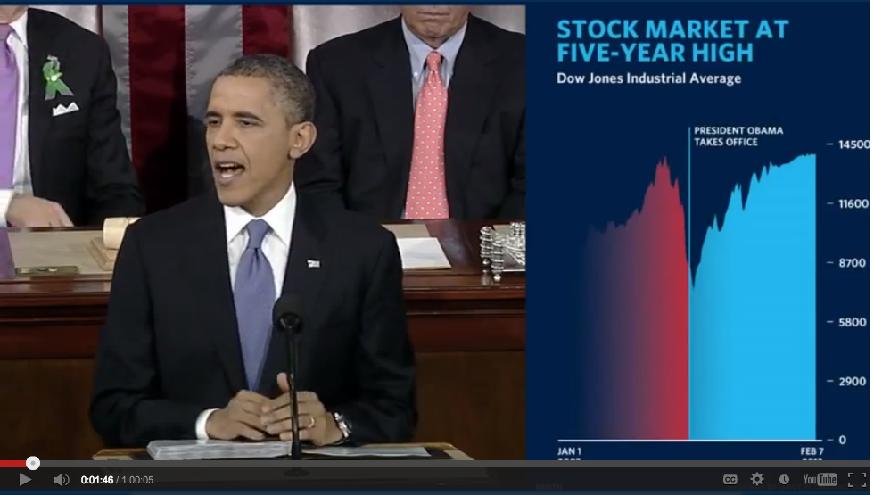
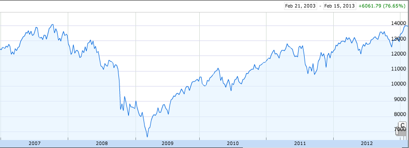
The following example shows another effective use of color, but it also makes a compelling visual statement by stretching the vertical axis and shrinking the horizontal axis. Compare it with the second graph below, which displays the same data. Because the years in the second graph are included in the horizontal axis and it is much longer, the second graph emphasizes how long the stock market recovery has taken, as opposed to the president’s that emphasizes the fact that it has actually occurred.
While this post focuses on a couple of economic charts shown during the address, the White House also presented a continuous, effective array of graphics using text and photos to create visual immersion. As the 2011 Persuasion Strategies Visual Persuasion Study by Broda-Bahm’s research team found, graphics used continuously, so that imagery is shown throughout the presentation, has many advantages. I encourage you to view more samples in the enhanced version of the State of the Union Address for ideas and inspiration that you can use in your next case presentation.
If you’d like to receive updates from this blog, please click to subscribe by email.


