
 I always like to share examples of what I consider powerful graphics to give attorneys ideas on what’s possible to create for use in litigation. This morning, I was struck by a video going viral that describes economic inequality in the United States.
Regardless of your politics, and whether you believe that the widening gulf between the poor and super-rich is a serious problem or mere propaganda of the Occupy Movement, I hope you’ll watch this video because it’s a fantastic example of how to show data in an effective and engaging way. In particular, if you’re an attorney who presents cases with large amounts of economic facts and figures, you’ll want to see how this video combines storytelling with clean, simple and powerful data visualization techniques.
One thing I appreciated immediately is the power of the narrator, enhanced by the pacing that he uses. His technique is similar to that of a good attorney giving a closing statement. His speaking is well paced and a creates appropriate tension in that you want to know what he is going to talk about next. The narrator starts with a discussion on the perceived state of income distribution in the United States. If you have not seen the video before reading this, below is the graphic that summarizes the findings, but you might find the summary difficult to understand. This is a terrific example of why in litigation graphics, you want to “build” your argument by revealing information one step at a time, as this video does, until you reach the conclusion; otherwise, you risk confusing your audience.
Rather than hit the viewer with a lot of information all at once, the video starts out with statistics on what people in the U.S. think the distribution of wealth is, and then compares that to what people believe it should be. The narrator shows this with a graph that dynamically slides the percentages to match the new data. Using tools like Adobe Flash, this type of dynamic movement is visually engaging and relatively easy to accomplish.
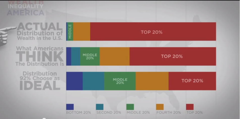
This “building” of information also sets up a conflict between appearance and reality, since the entire point of the graphic only becomes apparent when he reveals the actual distribution of wealth and compares it to the first two sets of data (what people think it is, and what they believe it should be, as shown in the above screenshot). The effect convinces the viewer that the distribution is much more unequal than most anyone actually imagines. If the above chart were a static board rather than an animated presentation, the tension of appearance vs. reality would be lost because you would immediately see the answer. Additionally, you would risk confusing the audience by having too much information that needs explanation all in one place.
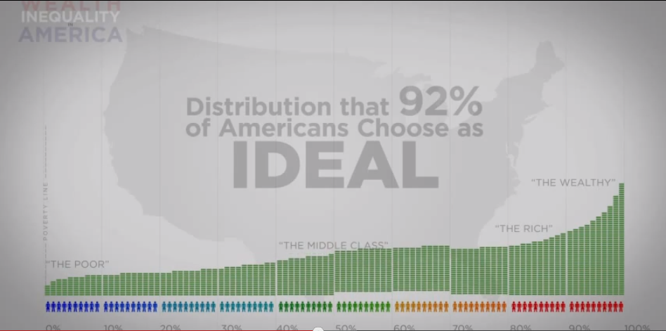
The video then uses essentially the same data, but with different visuals to drive home the same point. It starts out by presenting the total yearly wealth of the U.S. and showing its distribution under the “ideal” scenario.
The video then graphically compares that ideal to the actual distribution of wealth.
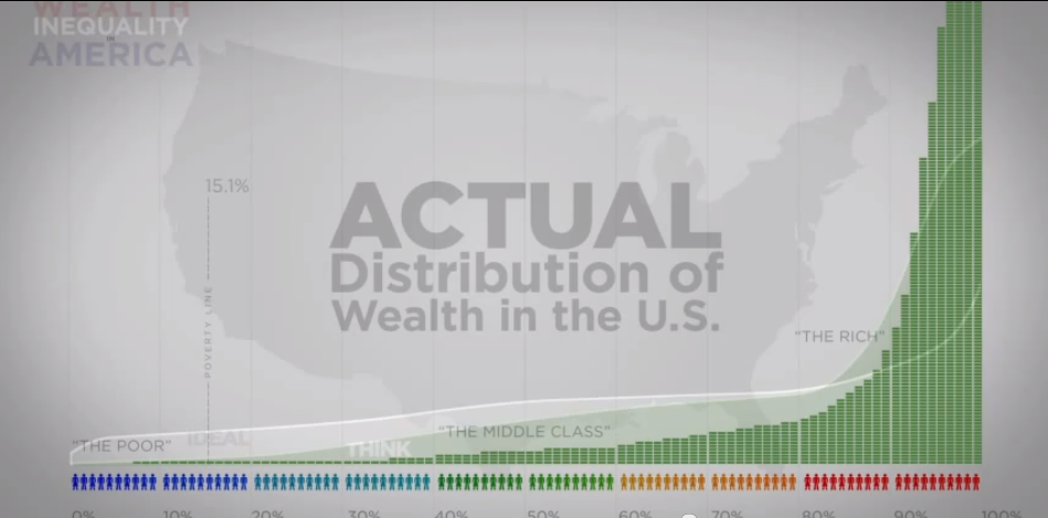
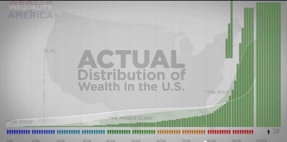
By using animation to move from one graphic to the other, the viewer can literally see the changes to the various groups as the numbers change. The video also takes advantage of the fact that numbers at the higher end of the spectrum literally go off the page by pointing this fact out, and then making a separate category to account for the top 1% of income earnings in the United States (where you see the person in the screen shot below on the far right with 40% of the total income for the country).
While people can debate ad nauseam whether this income distribution is good, bad, accurate or exaggerated, there’s no denying that this video does a great job of graphically laying out the facts as a good advocate or trial attorney should do. Imagine trying to follow, understand and remember all of this data if you had your eyes closed and just listened to the narrator, without watching the video. It would be a lot harder—and less interesting—to follow, wouldn’t it? The same is true when attorneys present fact- and number-heavy arguments to jurors. Without visual aids, the jurors have a more difficult time following along. Visual aids—especially dynamic, clean graphics that build an engaging narrative—help the attorney hold the jury’s attention and drive the point home.
Your opponent will always have ways to respond to your arguments, but starting with a great presentation that visually guides the viewer through your facts is a powerful way to present your case.
If you’d like to receive updates from this blog, please click to subscribe by email.