 Most people don’t find data beautiful, but it really can be. I am definitely not talking about Excel sheets with endless pages of numbers, but rather about data that is visualized in an appealing manner, which actually can be an exciting and powerful work of art. Complex data, when arranged in understandable ways, can reveal patterns that simply cannot be known and understood until you see them.
In a recent case, Cogent Legal was hired to create the visuals for a highway defect case that involved a large amount of accident history data for a one-mile section of road (over 600 accidents of various types over five years). When I heard that the state produced the data in an Excel format (rather than paper form), I was excited because I knew what could be done with such data.
Adobe Illustrator has a feature that allows data from an Excel sheet to be imported directly into Illustrator and placed on an X and Y axis. Illustrator then takes this data and correctly plots it directly from the sheet. You may well be asking why this is so special since Excel and similar spreadsheet programs can create their own charts with the touch of a button. The answer is that once the data is imported into Illustrator, the possibilities for endless creativity and visualization start.
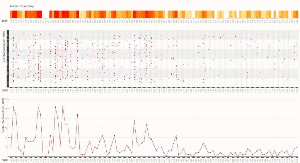
This first sample below (click to enlarge in new window) is not terribly different than charts you can get with a program like Excel. My designer created this as a first step to help her understand the data patterns and create a graphic that our client could use in court. At the bottom it shows a summary of all types of accidents combined along the specific section of roadway. The middle section features a scatter chart style that actually breaks down each accident by type of accident. Finally, at top is a shaded graph that overlays each time there is an accident in a specific road section on top of the other so the amount of accidents is represented by darkening colors for more accidents.
You can see there is a spike in accidents along the roadway section associated with the left-hand side of the graph (which happens to be where the subject accident occurred.)
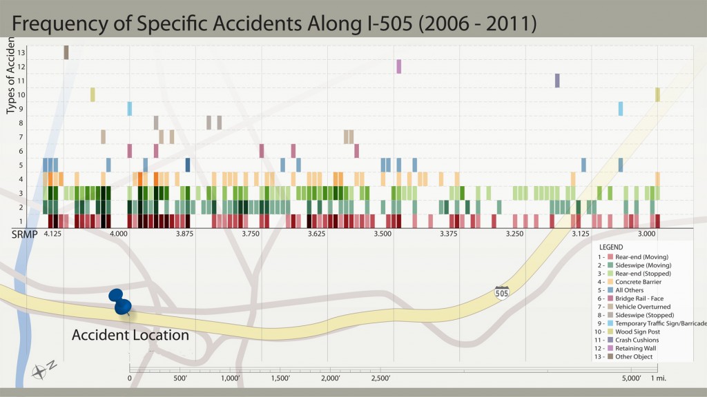
The second step is to arrange the data in a way that is best for understanding at trial. This next chart takes the raw data from the first and plots it across a graph of the road to make it physically tie the data to the specific section of road (click to enlarge).
This graph allows each of the 600-plus accidents to be seen at one time with shading indicating more accidents in any one section of road. This chart can be used by an expert to help explain all the different types of accidents, and the increase in frequency near the area of the subject accident, to help support an opinion of highway defect.
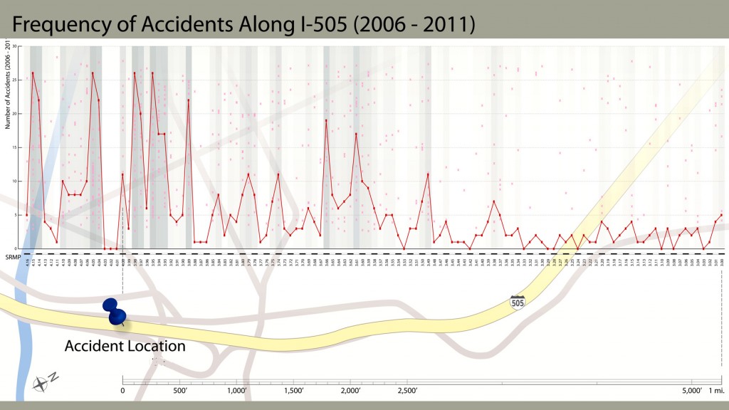
As an alternative, if the focus is simply on the overall amount of accidents (rather than the specific type), the following provides a visualization of the frequency of accidents in the area.
Taken together, these graphics visually translate an extremely large amount of data into an understandable and attractive graphic that can be interpreted by an expert and jury. Since this data is directly imported from the Excel sheet produced by the state, an expert has a foundation to get this admitted into evidence, and it can be studied by the jury during deliberations. The jurors are much more apt to study and understand the graphics than they would an Excel sheet.
Trial graphics firms, such as my own, generally preach to all who will listen that attorneys must break down information into easily understandable bits and then “build” the information for the jury one piece at a time. The rule of thumb for litigation graphics is to keep it simple and direct. I wholeheartedly agree, but there are times when the visualization of massive amounts of data—and showing that data all at once, as opposed to piece by piece—is called for and extremely valuable, as in the case above.
If you have a case with a mountain of data, consider importing the data from Excel into Adobe Illustrator to create visually appealing graphics to which a jury will respond. Or contact us if you would like to talk about how this method might help your case.
If you’d like to receive updates from this blog, please click to subscribe by email.


