
 Professor Edward Tufte, the guru of information graphic design, advises his students to study the design of popular websites to learn techniques for conveying information quickly and efficiently. In today’s post, I’ll take Tufte’s advice and look at some of the techniques that NPR’s Planet Money reporting team used in creating an engaging page about the making of a T-shirt.
(By the way, Professor Tufte will be in the Bay Area next week, Dec. 9 – 11, teaching his great one-day course in Presenting Data and Information—a highly recommended course for those interested in conveying information in graphics—see Tufte’s website here for information and to register.)
Think about how in litigation, especially business litigation, you sometimes have to make a seemingly dull or boring topic interesting. Few people ever think about T-shirts, yet Planet Money manages to tell many engaging stories about shirts, in large part through the use of data visualization and other graphics. If the story of a T-shirt can be made interesting, it gives hope that one should be able to make the stories of many legal disputes interesting with informational graphics.
The Planet Money T-Shirt Story
Planet Money is a group of National Public Radio (NPR) reporters who report on economic issues for NPR shows and in a Planet Money blog and podcast. More than three years ago, they had the idea to report on the “hidden world behind clothes sold in this country,” so they decided to make a T-shirt and report on everything connected to the making of the shirt. They did a Kickstarter campaign where over 20,000 people prepaid for T-shirts (funding Planet Money’s reporting), and they then followed the story around the world of the making of a T-shirt.
On December 2, 2013, Planet Money launched a special website telling the story of the T-shirts. The website has an intro video and chapters on cotton, the machines which make the shirt, the shipping of the shirt, and the people who worked to make the shirt.
I am a fan of Planet Money, and I’m looking forward to the arrival of my Planet Money T-shirt any day now. I’m not writing this post just to plug a great podcast though. I also noticed some good techniques used by Planet Money in telling their story, so I thought I’d share some of what I noticed because these techniques are helpful for litigators.
A Well-Laid-Out Data Table
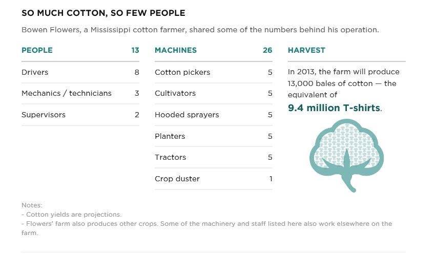
This table from the cotton page suggests several lessons for litigators:
- Use color and font to highlight key information such as the highlighting of the “9.4 million T-shirts.”
- Consider placing totals at the top of the table to emphasize the totals (e.g., see the totals for people and machines).
- De-emphasize less important information with color, font and/or placement (e.g., the notes in a light gray color in the footer).
- Use small graphic elements such as the cotton blossom here to visually connect the data with something tangible.
A Report Card Analogy and a Nice Picture to Explain Unfamiliar Numbers
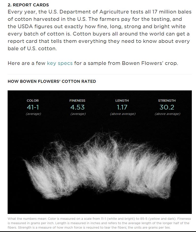
The excerpt above from the cotton page tells the story of how cotton is rated. A few lessons here:
- Use familiar analogies (e.g., the “report card”);
- Use pictures to liven up the explanation of data. Here, the photo of the cotton is not explicitly connected to measurements such as strength, but the photo makes it more interesting.
- Use short summaries to help the audience (e.g., the use of the “average” and “above average” parentheticals in the photo above).
Videos and Subtitles
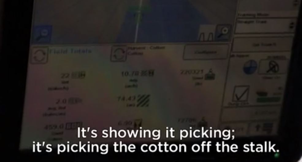 In explaining cotton growing and harvesting, the cotton page employs a video. The video screenshot above suggests another couple of lessons for litigators:
- Use video to explain the function of computer programs—it is a fast way to quickly show how something like this GPS application for cotton harvesting works.
- Use subtitles on videos whenever there is a chance the audience will not hear or understand the speaker.
Animate the Building of a Graph
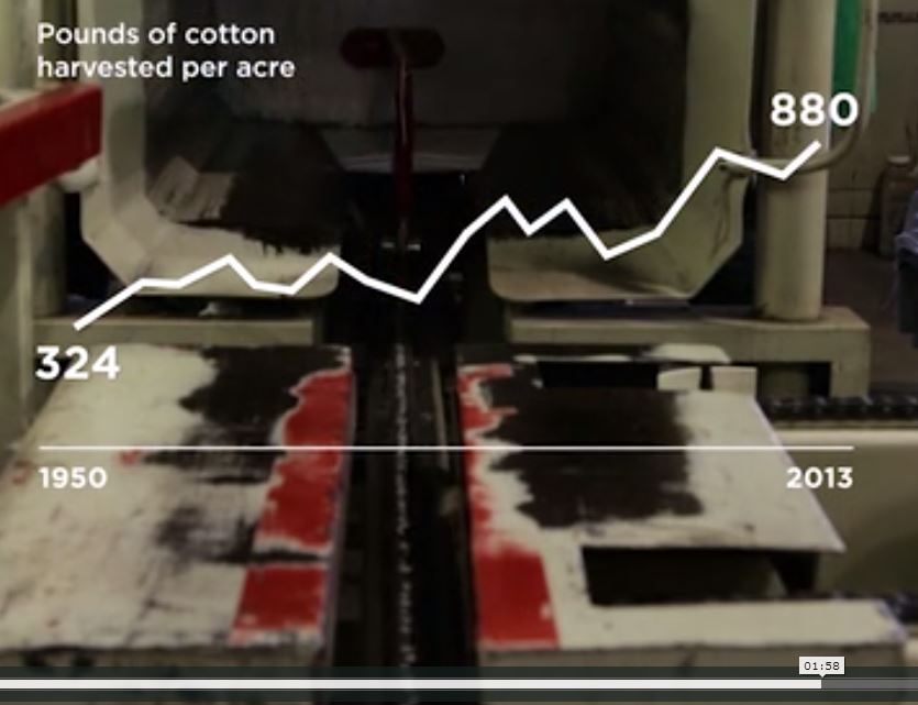
In the video on the cotton page, the story discusses the growth in cotton production with an animated graph that builds over a few seconds. Some lessons here:
- Use an animated graph when you want to emphasize change. The movement of the animation helps communicate the concept.
- For visual interest, consider displaying a graph over a related image as here where the graph is over an image of a baling machine.
- Consider whether the graph can be simplified by omitting an axis and just displaying end point information as is done in the image above.
Annotated Photographs
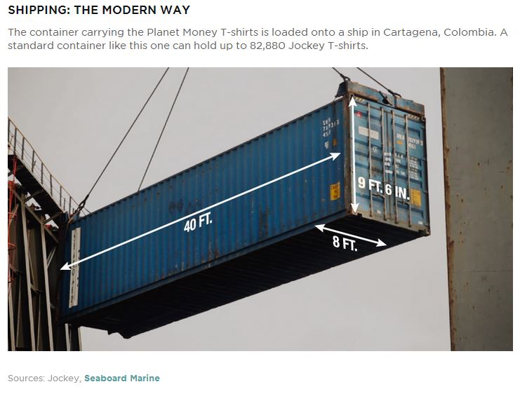
The annotated photograph above from the page on shipping containers illustrates another important lesson:
- Annotations on photographs can be used to communicate scale effectively.
- Labeling locations or parts on confusing-looking images, such as aerial photographs from a scene or MRIs from medical records, greatly helps the viewers understand what they’re viewing.
Put a Face on the Story
In closing, one more lesson that this T-shirt story can teach: On its site, Planet Money connects the story of the T-shirt to the people involved with making it; in other words, it puts a face on the story by telling about the people behind the thing. People like to hear stories about other people. In litigation, think about how you can connect the facts of your case to the story of real people. In a patent case, for example, this could involve telling the story of the inventor behind the invention. Then, use pictures, not just words and numbers, to show that story.
If you’d like to receive updates from this blog, please click to subscribe by email.